Samsung Car-Mode: Enhancing the Visual Experience with Improved Usability

Case study 2014

Overview

In today's fast-paced world, where smartphones have become an integral part of our lives, the Samsung Car-Mode provides a convenient and safe way to interact with our devices while on the road. However, as technology advances and user expectations evolve, there is a need to redefine the car-mode visual experience to ensure better ease of use for Samsung car-mode users.

Company:  Samsung R&D (ICT)
Platform: Samsung phonesProject
Duration: May 2014


My role

As a Design lead my main areas of responsibility:
Research (Understanding & Findings)Solution (Exploration of ideas)Testings (Usability concerns)Present (UX leaders/ stakeholders)

My role

As a Design lead my main areas of responsibility:
Research (Understanding & Findings)Solution (Exploration of ideas)Testings (Usability concerns)Present (UX leaders/ stakeholders)

Problem

The existing Samsung smartphone visual design experience caters to general use cases and purposes. However, it falls short in effectively serving the needs of users who specifically utilize the car-mode app while driving. Several problems have been identified with the current experience, including:

  1. Poor Fit for User Needs/Context: The existing visual experience fails to align with the unique requirements and context of users who rely on the car-mode app while driving. The interface may not provide the necessary ease of use and accessibility required for safe and convenient interaction.

The existing Samsung smartphone visual design experience caters to general use cases and purposes. However, it falls short in effectively serving the needs of users who specifically utilize the car-mode app while driving. Several problems have been identified with the current experience, including:

  1. Poor Fit for User Needs/Context


  1. Visual Distraction & Cognitive Load: The current design may contribute to visual distractions and increase the cognitive load on users while operating their smartphones in car-mode. Complex or cluttered visual elements can divert attention from the road and impede user concentration.

  2. Incompatibility with Different Light Conditions: The visual design does not effectively adapt to varying light conditions encountered during driving. Inadequate visibility, poor contrast, or reflections on the screen can hinder the user's ability to perceive and interact with the car-mode app accurately.

  1. Visual Distraction & Cognitive Load

  2. Incompatibility with Different Light Conditions:

Design menthodogy

Approach

This is my favorite part of Dell. I like the fact that they have a clear & simple process that helps us explore problems, synthesize, prioritize & explore design solutions, and validate. It's collaborative, everyone is involved in this process from the beginning (problem discovery to implementation phase) so there would not be any surprises and the perfect balance in the team. The whole idea here is to go from uncertainty to certainty by defining MVP.  ​​​​​​

Understanding

Understanding problem space. 
User pain points.
Secondary research.
Usability analysis

Design

Brainstorming, ideas Explorations.

Prototype & test

Usability test, and iterate designs.

Secondary research

Understanding

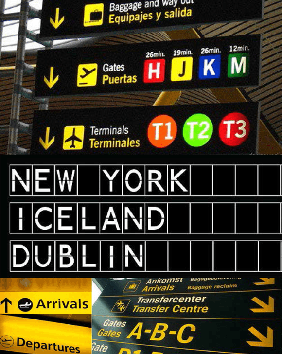
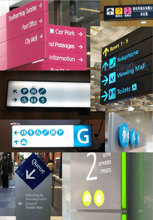
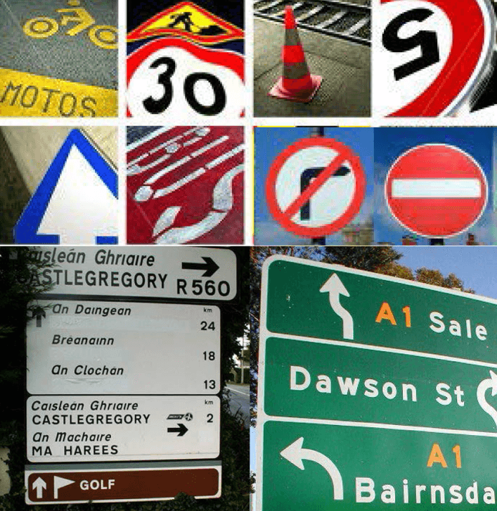
To gain a deeper understanding of the problem area, I conducted a heuristic usability evaluation with the team, which revealed some immediate concerns and issues. However, I recognized the need to delve further into what makes the user interface truly usable and accessible for car-mode drivers. To achieve this, I expanded my research to alternative environments such as streets, highways, shopping malls, and airport signage. By drawing insights from these different contexts, I was able to gather valuable information that guided my direction in redefining the Samsung car-mode visual experience.

Shopping Mall Signages

Shopping Mall Signages

Street & Highway Signages

Airport Signages

Airport Signages

Findings.

• Users quickly glance and read displayed information with minimal interruption to primary task.

• Visuals should require minimal user attention, yet retain maximum understandability.

• Thus, enabling users to understand information with minimum time and low cognitive effort.

• Short words are easy and faster to read in lower case.

• Works well for different light conditions (Day & Night).

• Designed to be a glance at, not to study.

Shapes.

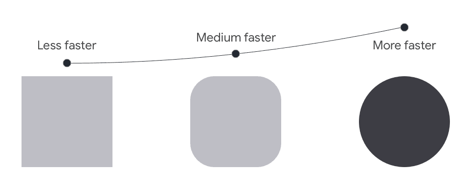
Here is how the human eye perceives shapes

• Circle shape is cognitively faster to process for the human eye (fovea) thus, aesthetically pleasing.
• Put the focus inside the circle. 
• Circle is organic in shape so it communicates motion
• Triangle, square shapes appear to be static & rigid because of their form

Colors.

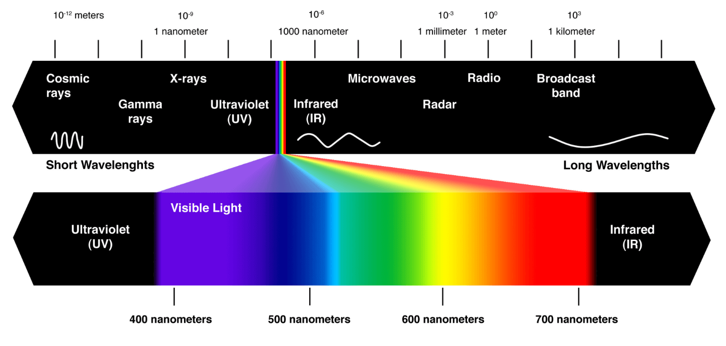
The visible light spectrum!

• The visible spectrum is the portion of the electromagnetic spectrum that is visible to the human eye.
• A typical, human eye can perceive wavelengths from about 400nm to 750nm
• Humans are trichromatic—the eye retina contains three types of color receptor cones.
• RGB - is these three colors that are mixed in our brain to create all of the other colors we see.

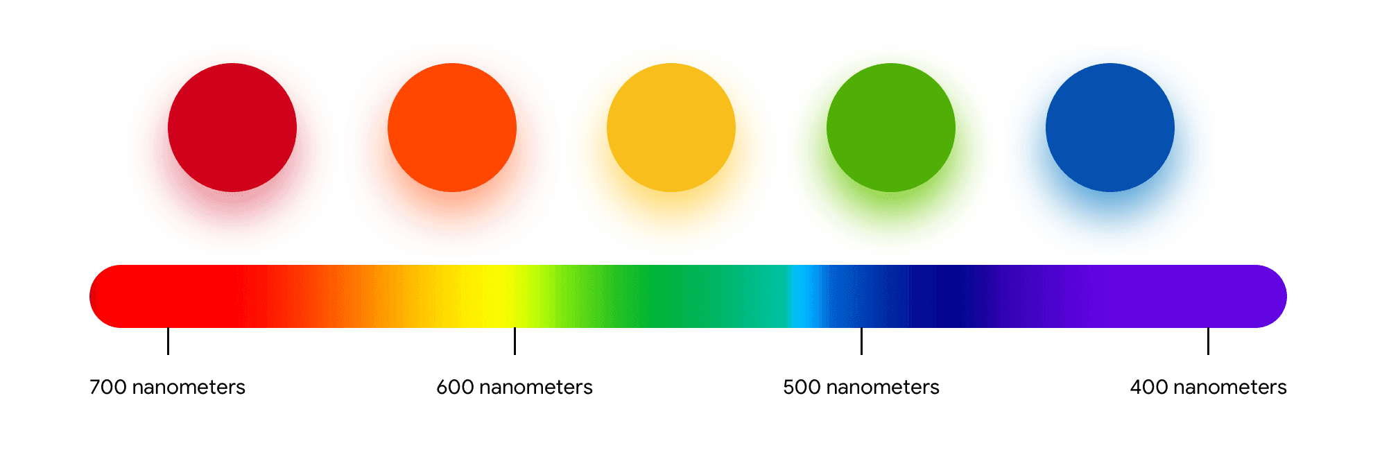
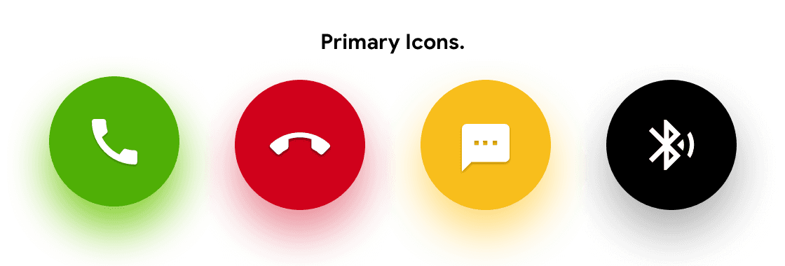
• Colors that work well in low light conditions are -
red, orange, yellow, green. Require low energy, also stand out for the human eye.
• Colors that require more light conditions are - violet, indigo, blue, dark shades. These are not glanceable colors.
• Dark color observes light, thus it doesn't reflect. 

Iconography.

The visible light spectrum!

Simple & solid form.

Significantly clear.

Faster to select & perceive.

Solid
Simple & solid form.

Significantly clear.

Faster to select & perceive.

Harder to recognize in motion/ move.

Oversimplified.

More cognitive effort.

hollow

Harder to recognize in motion/ move.

Oversimplified.

More cognitive effort.

Typography.

• Works well for the digital screen.
• Legibility and readability.
• Easy to read in smaller cases. 
• Aesthetically good.

Light & Contrast

  • High contrast is crucial for maximizing legibility and readability, particularly in well-lit environments.


  • An overall darker theme could create a higher cognitive load and demand more focus from smartphone users, especially when they are in motion.


  • Colors such as red, yellow, green, orange, and magenta have higher luminance values, making them stand out effectively in any lighting conditions. Considering these insights, the redesign of the Samsung car-mode visual experience can prioritize high contrast for legibility, carefully balance the use of dark elements to minimize cognitive load, and strategically utilize attention-grabbing colors to enhance visibility.

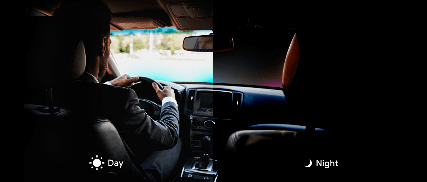
Day

  • High contrast is crucial for maximizing legibility and readability, particularly in well-lit environments.


  • An overall darker theme could create a higher cognitive load and demand more focus from smartphone users, especially when they are in motion.


  • Colors such as red, yellow, green, orange, and magenta have higher luminance values, making them stand out effectively in any lighting conditions. Considering these insights, the redesign of the Samsung car-mode visual experience can prioritize high contrast for legibility, carefully balance the use of dark elements to minimize cognitive load, and strategically utilize attention-grabbing colors to enhance visibility.

  • In dark or low light conditions, white or light-colored elements on the phone screen can illuminate more light, causing strain on the eyes and creating distractions for users while driving.


  • Black or dark colors are preferable as they absorb light in the color spectrum, except for red, yellow, and green, which are more visually comfortable and less distracting in low light conditions.


  • Black or dark colors also convey a sense of style, elegance, and confidence, aligning with the desired user experience. Taking these findings into account, the redesigned Samsung car-mode visual experience can incorporate darker color schemes to reduce eye strain, minimize distractions, and enhance the overall aesthetic appeal in context.

Night

Concept

Design

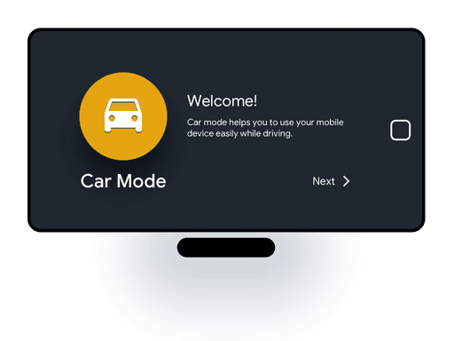
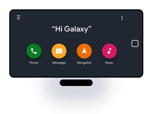
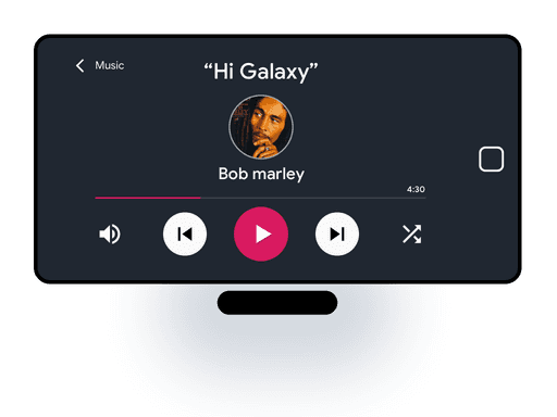
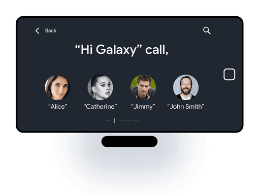
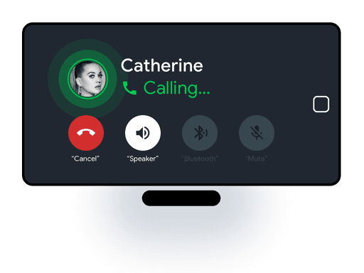
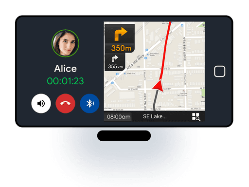
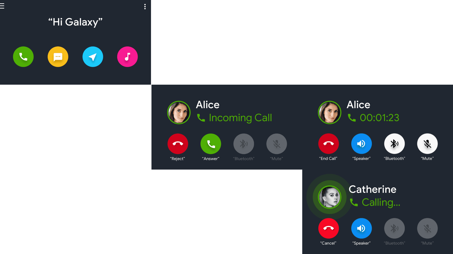
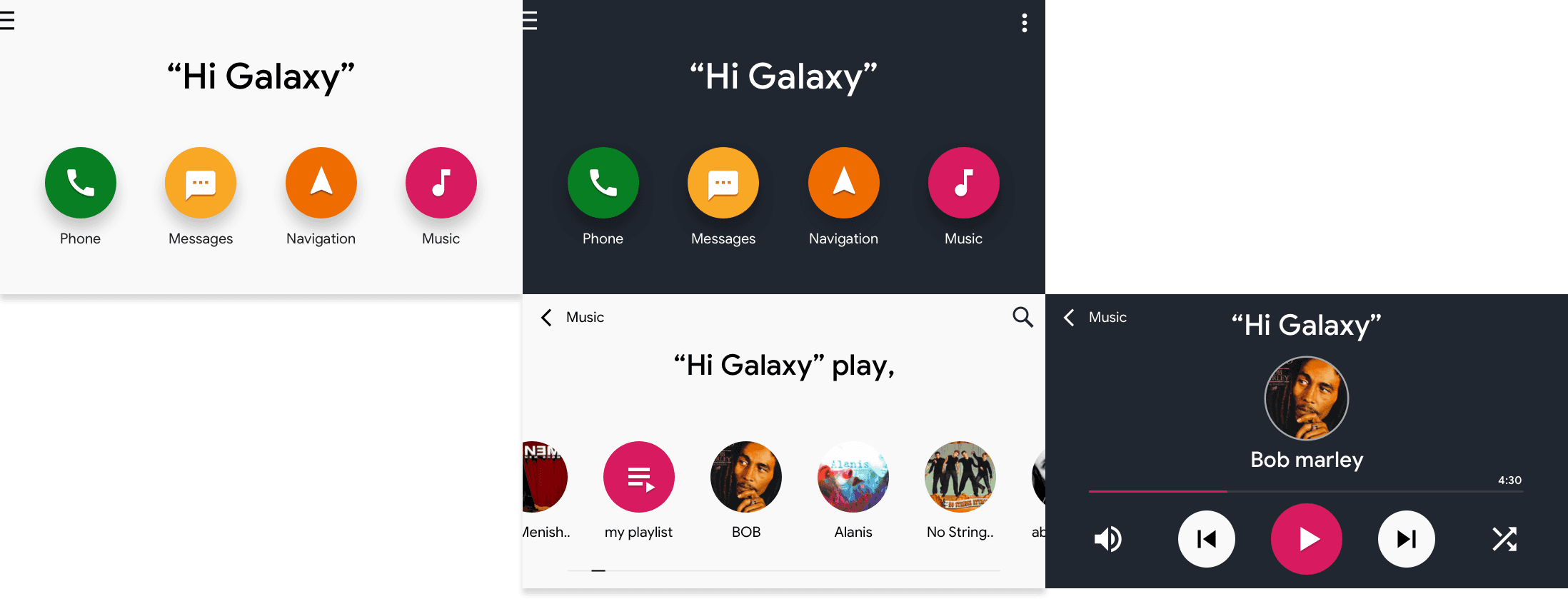
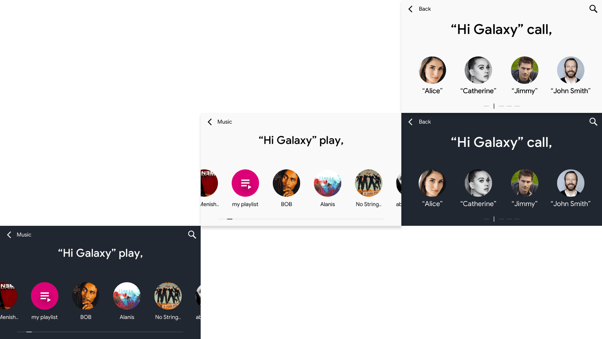
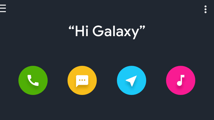
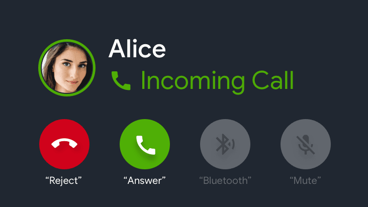
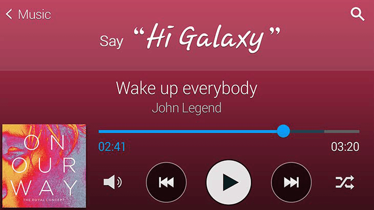
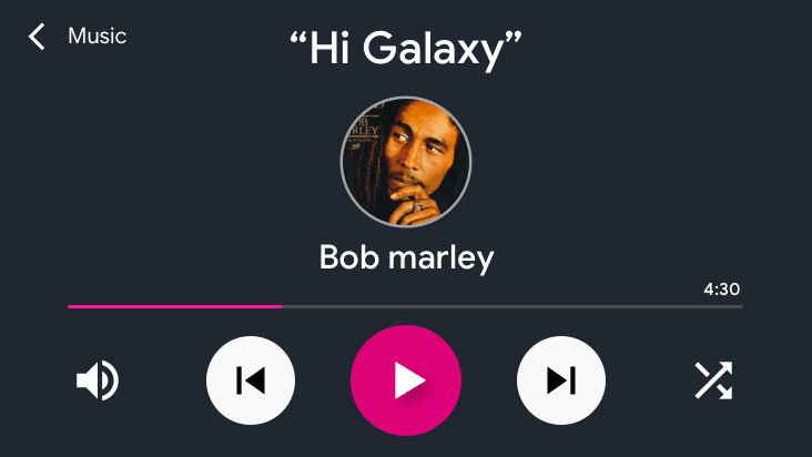
Based on the findings and insights, a series of design options were explored, resulting in the creation of a low-fidelity prototype. This prototype aimed to test and validate the usability aspects of cognitive load, different light conditions, readability, and legibility. The key screens of the final designs, which emerged from the testing phase, are presented below. These designs incorporate the identified principles and considerations for a more user-friendly and visually optimized Samsung car-mode experience.

Design & testing

Solution

Glanceable

Low Cognitive Load.
Minimize Visual interruption to the user’s primary task.
A visual experience that fits into the user's context.

Light & Dark

The color theme for a different light condition.
Thus, easy to perceive information.

Legibility and Readability.

Legibility and
Readability.

High contrast & San-serif maximize legibility and readability in direct/ indirect light conditions. 
Lowercase letters are easier and faster to read.

Key Screen

Comparison

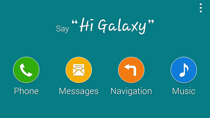
Here are a few high-level visual screen examples that showcase the comparison between the existing and proposed visual design experience for Samsung car-mode

Existing

Proposal

Take away

Result & Learnings

During the project, the redesigned visual experience for Samsung car-mode was well received by stakeholders. The concept was showcased at the headquarters in South Korea, indicating its positive reception and potential for implementation. As a Visual Designer, this project provided valuable insights into the science behind colors and shapes, highlighting how humans associate meaning and emotions with visual elements. The learnings gained from this project have contributed to the designer's growth and understanding of user-centered design principles.
Thanks for stopping by!

Thanks for stopping by!